


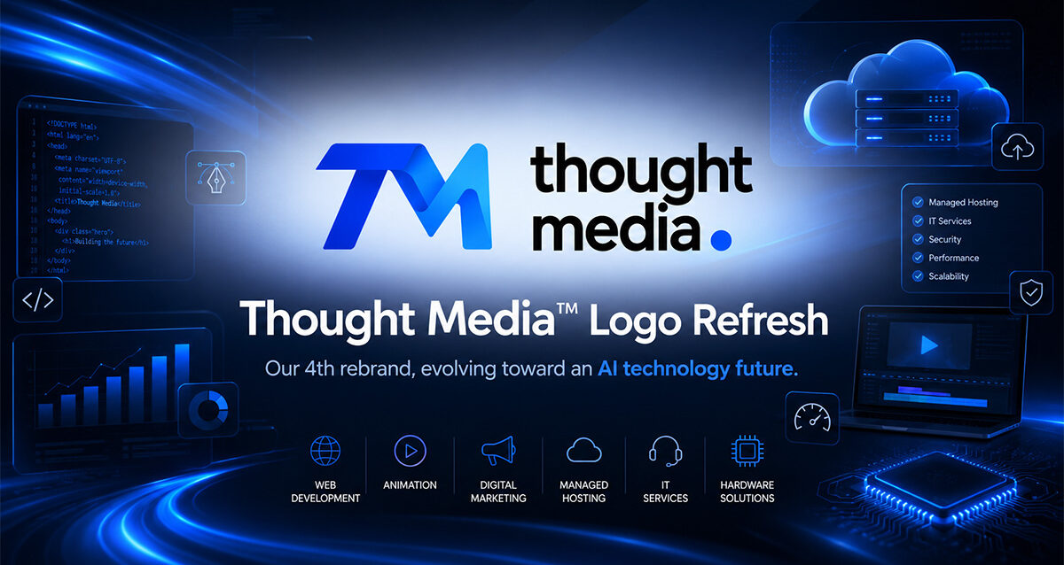
Thought Media™ has continued to evolve with the industries, organizations, and technologies we serve since 2009. After 10+ years with our previous branding we have entered an era that prompted us to create a new identity that aligns with our AI-driven technology company.
What began with a strong foundation in web design, and creative media has expanded into a broader technology company supporting clients across AI, web development, digital marketing, animation, managed hosting, IT services, and hardware solutions.
Our latest logo refresh represents that next stage.
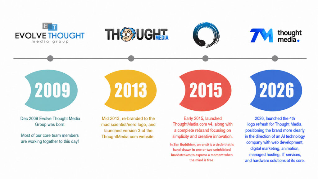
This is the 4th rebrand logo refresh in the history of Thought Media™, and it reflects a more focused move toward our future as an AI technology company with digital strategy, creative production, technical infrastructure, and business technology solutions at our core.
The new identity is cleaner, more modern, more scalable, and more aligned with the type of clients and ideal customer profiles we serve worldwide.
Why Thought Media™ Refreshed The Logo
A strong logo should represent where a company has been.
But more importantly, it should represent where the company is going.
Thought Media™ has expanded well beyond traditional web design. Today, our work supports organizations across multiple areas of digital and technology infrastructure, including:
AI development and automation
Website design and development
SEO and digital marketing
Video animation and visual communication
Managed hosting and website support
IT services and technical consulting
Hardware and technology solutions
As our services have grown, our brand needed to reflect a broader and more future-ready position.
The previous Thought Media™ identity served the company well during an earlier chapter where creativity, design, and digital marketing were the primary focus. The new direction required a mark that feels more technical, more structured, and more aligned with the needs of modern organizations operating at a larger scale.
A More Future-Ready TM Monogram
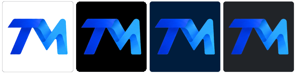
The refreshed logo introduces a modern TM monogram that feels sharper, more dimensional, and more technology-driven.
The interlocking ribbon-style design gives the logo a sense of movement, connectivity, and transformation. These ideas are important because Thought Media™ often works at the intersection of strategy, technology, design, marketing, infrastructure, and operations.
The “T” and “M” are designed to work together as one connected form.
That reflects how Thought Media™ approaches client work: not as isolated services, but as connected systems.
A website connects to marketing.
Marketing connects to automation.
Automation connects to AI.
AI connects to operations.
Hosting, IT, and support keep everything running.
The new logo is intended to represent that connected ecosystem.
Why Blue Remains Central To The Brand
The refreshed logo keeps Thought Media’s blue color direction.
Blue continues to make sense for Thought Media™ because it communicates trust, stability, intelligence, and technology. These qualities are increasingly important as the company continues to support larger, more complex, and more technically mature organizations around the world.
The updated blue gradient gives the logo more energy and depth without moving away from a professional look. It feels modern, digital, and premium while still staying grounded.
The darker blue gives the mark strength.
The brighter blue adds innovation and forward motion.
The gradient creates a sense of dimension and evolution.
Together, the colors help position Thought Media™ as both established and future-focused.
Better Aligned With Our Worldwide Client Profile
One of the goals of the refresh was to create a logo that feels more aligned with the organizations Thought Media™ serves today.
Many of our clients are becoming more advanced, more technical, and more focused on long-term digital infrastructure. They need partners who understand strategy, implementation, automation, security, hosting, content, marketing, AI, and ongoing support.
This includes businesses, enterprise organizations, government-related organizations, public-sector teams, and growing companies across different markets worldwide.
The new identity is designed to feel:
More professional
More technical
More scalable
More modern
More confident
More aligned with complex client needs
The updated wordmark uses clean black typography, which creates stronger contrast against the blue monogram. This helps the brand feel more mature and balanced while allowing the TM icon to carry the technology-inspired color system.
Why This Is More Than A Design Update
This refresh is not just about changing the way the logo design looks.
It is about clarifying what Thought Media™ is becoming.
The company is moving into a broader technology position. Web development and digital marketing remain important, but they now sit within a larger ecosystem that includes AI, automation, infrastructure, managed services, animation, hosting, IT support, and hardware solutions.
That means the brand needs to communicate more than creativity.
It needs to communicate capability.
It needs to communicate systems thinking.
It needs to communicate technical confidence.
It needs to communicate that Thought Media™ can support organizations across multiple layers of their digital and technology environment.
The Meaning Behind The 4th Rebrand
This being Thought Media’s 4th rebrand logo refresh is important.
Each brand stage has reflected a different chapter of the company.
Earlier versions represented the foundation of the business: creativity, web design, media, and digital marketing.
This latest version represents the next chapter: AI, technology, infrastructure, and integrated digital solutions.
It is not a departure from what Thought Media™ has always done. It is an expansion of it.
The company is still rooted in web development, marketing, design, and communication. But the modern client environment now requires more than websites and campaigns. Organizations need integrated technology partners that understand AI, automation, hosting, IT, content, data, digital infrastructure, and long-term support.
That is the direction this new logo is designed to support.
What The New Logo Represents
The refreshed Thought Media™ logo represents several core ideas:
Technology
The sharper TM monogram gives the brand a more modern, software-driven feel.
Connectivity
The ribbon-like structure reflects connected services, connected systems, and connected digital experiences.
Transformation
The movement in the mark reflects change, growth, and forward momentum.
Trust
The blue color palette supports credibility, stability, and professionalism.
Expansion
The new identity gives Thought Media™ room to grow across AI, web, marketing, animation, hosting, IT, and hardware solutions.
Global readiness
The cleaner typography and more structured visual identity make the brand better suited for the broader range of organizations Thought Media™ serves worldwide.
Where Thought Media™ Is Going Next
The new logo is a visual signal of where Thought Media™ is heading.
We are continuing to build around a broader technology model that helps organizations plan, create, launch, market, automate, host, manage, and support their digital operations.
That includes:
AI strategy and development
Website and platform development
Search engine optimization and digital marketing
Animation and video communication
Managed hosting and website support
IT services and consulting
Hardware and technology solutions
The goal is to continue strengthening Thought Media™ as a technology partner for organizations that need more than a single-service vendor.
Conclusion
The new Thought Media™ logo refresh represents the company’s next chapter.
As our 4th rebrand logo refresh, it reflects a move toward a more modern, technology-driven, and AI-focused identity. The updated TM monogram, blue technology-inspired color palette, and clean black wordmark work together to create a brand that feels more aligned with the clients and organizations Thought Media™ serves worldwide.
This is not just a new logo.
It is a clearer representation of Thought Media™ as an AI technology company with web development, digital marketing, animation, managed hosting, IT services, and hardware solutions at the core of what we do.
FAQ
Why did Thought Media™ refresh its logo?
Thought Media™ refreshed its logo to better reflect the company’s evolution into a broader AI and technology company supporting modern organizations worldwide.
Is this a full rebrand or just a logo update?
This is primarily a logo refresh, but it also reflects a larger brand direction. It represents Thought Media’s continued expansion into AI technology, digital infrastructure, web development, marketing, animation, hosting, IT services, and hardware solutions.
What does the new TM symbol represent?
The TM symbol represents Thought Media’s initials while also communicating connection, movement, technology, and transformation through its interlocking ribbon-style design.
Why does the logo use blue?
Blue communicates trust, intelligence, stability, and technology. These qualities align with Thought Media’s direction as an AI and technology-focused company.
Why is the wordmark black instead of blue?
The black wordmark gives the logo stronger contrast, better readability, and a more mature professional feel. It also balances the blue TM icon so the overall identity feels cleaner and more scalable.